Secrets Revealed About the New Captivate
A world of information is presented to you when a company like Adobe does a sneak peek. I think they assume that everyone is going to merely follow the presenter as they show you one thing or another. What I like to do is look at the individual screens regardless of what the presenter is showing us and see what else I can learn about the future of this software. Here is what I've discovered so far. You can watch the video and/or read the article below:
Remember these are early days for what Adobe is calling Project Charm. It’s safe to say that most of what I'm showing here will end up in what will probably be called Adobe Captivate 2022, but there are no guarantee. Also, I wish to emphasize that I’m not revealing anything that cannot be found in their publicly available video found here on their YouTube channel. https://youtu.be/y4Wnnc7e9kY
Spectrum
At around 0:47 seconds into the video, Pooja Jaisingh, Lead eLearning Evangelist, Adobe Digital Learning Solutions, mentions Spectrum when referring to Captivate being completely redesigned. Spectrum is Adobe’s modern design system that I expect will eventually influence all their products moving forward. Pooja mentions that Spectrum is built to be inclusive. When you research Spectrum you learn that accessibility standards are something you can expect from products that are designed with this design system. While Captivate has been capable of publishing out eLearning that meets accessibility standards the product itself doesn’t meet those standards. I hope this means that future versions of Captivate will be accessible themselves. Meaning that accessible eLearning can be developed by the very people for who it was designed for. If this is true that’s very exciting news. You can learn more about what goes into Spectrum by visiting Adobe’s website here:
https://spectrum.adobe.com
The Welcome Screen
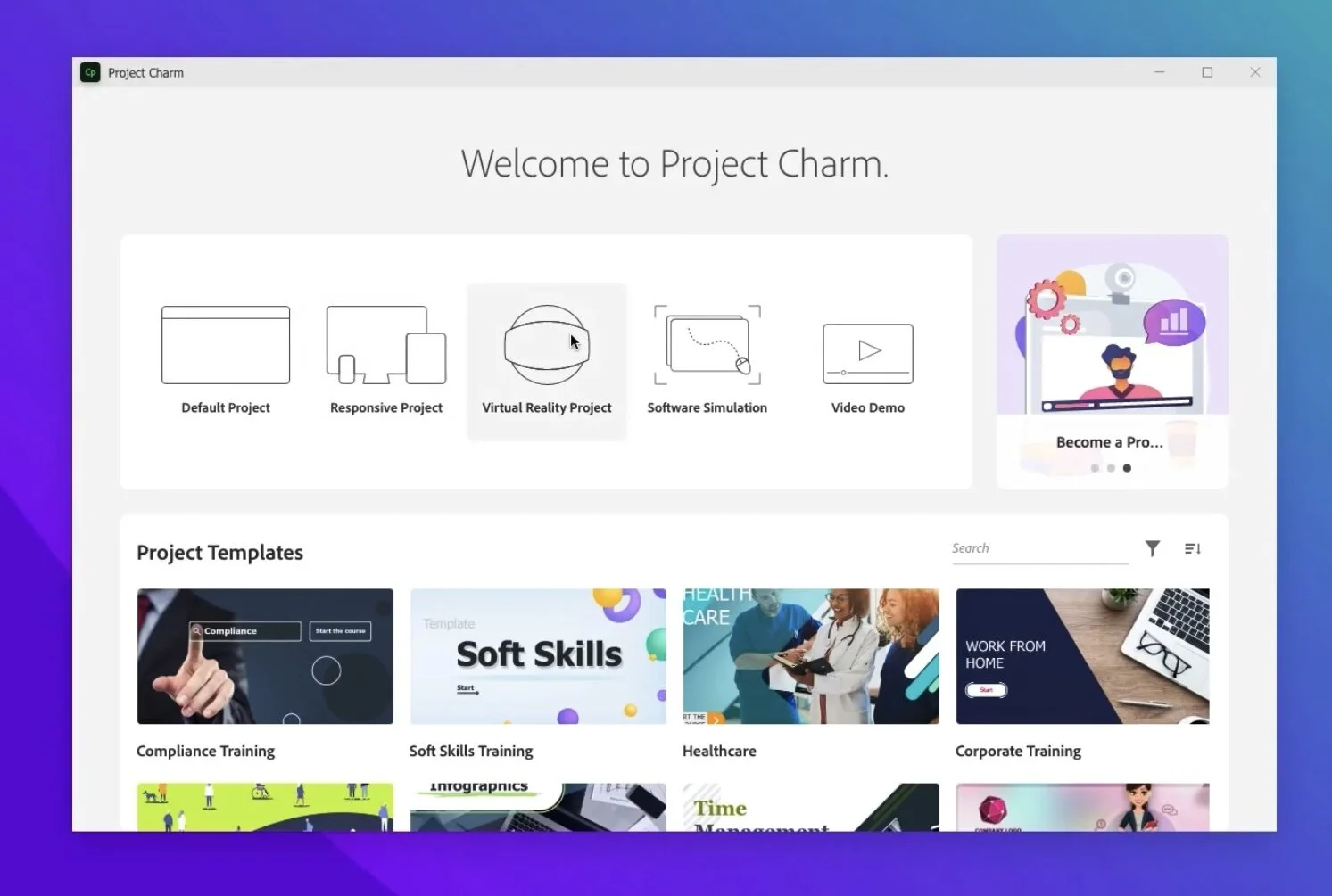
The welcome screen has been streamlined so that new projects are easy to select and create. An emphasis on project templates now exists that didn’t before. I think this will be a welcome addition for new Captivate users who might not know how to get started. in the upper right corner, there appears to be dynamic content that Adobe will push out to you to share the latest upcoming webinar or certification.
Welcome screen
User Interface
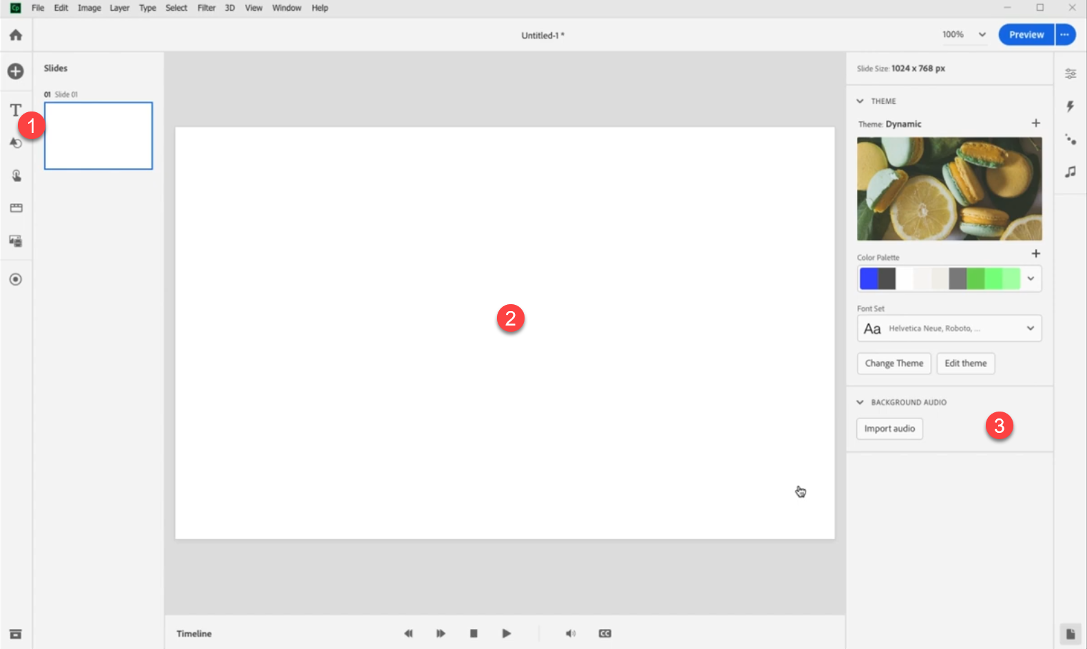
at around two minutes twenty seconds, we see the Spectrum interface in action. Pooja mentions a left-to-right workflow philosophy and I think that’s a great way to think about design. You will start on the left and select the type of object you wish to add, you move to the center where your canvas exists and place the object. finally, you will look to the properties inspector on the right where you will customize the parameters of that object you just added.
User interface
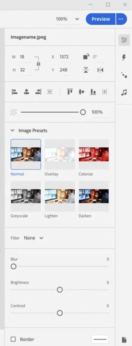
Options for images
It looks like there are some interesting choices for modifying images in this next version of Captivate. I like the idea of editing images at the touch of an option rather than round-tripping to an external app or opening a separate edit window. Of course, the hope is that this provides enough options. I'm very interested in the Blur option you can see in this screen capture.
Button options
Up to and including Adobe Captivate 2019, buttons have meant different things. Mostly what I call a button is a shape or image used as a button. I haven't used the classic Captivate button in years. Perhaps this is something new and better suited to HTML5.
Button options
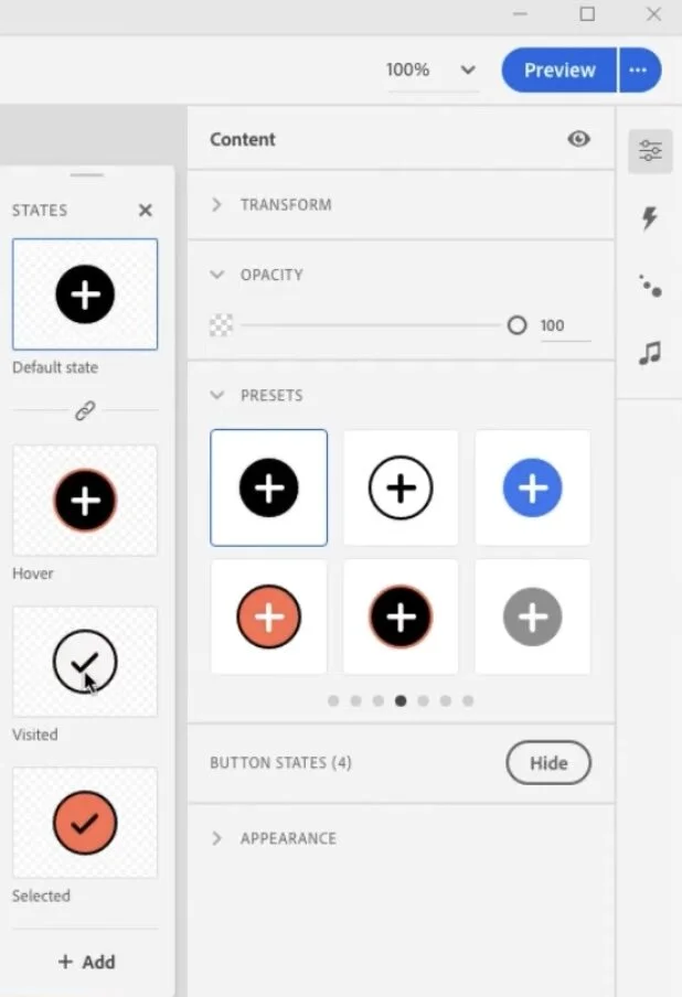
Button states
One thing I would like to see is more in-built states that are saved as part of the object style. This screenshot teases the possibility that there will be visited and selected states. I hope that I can save these as part of the object style so they can be applied to other similar buttons. Also selected would be a wonderful addition to the functionality of buttons as well. If I didn't have to write advanced actions for selected states that would save me a bunch of time.
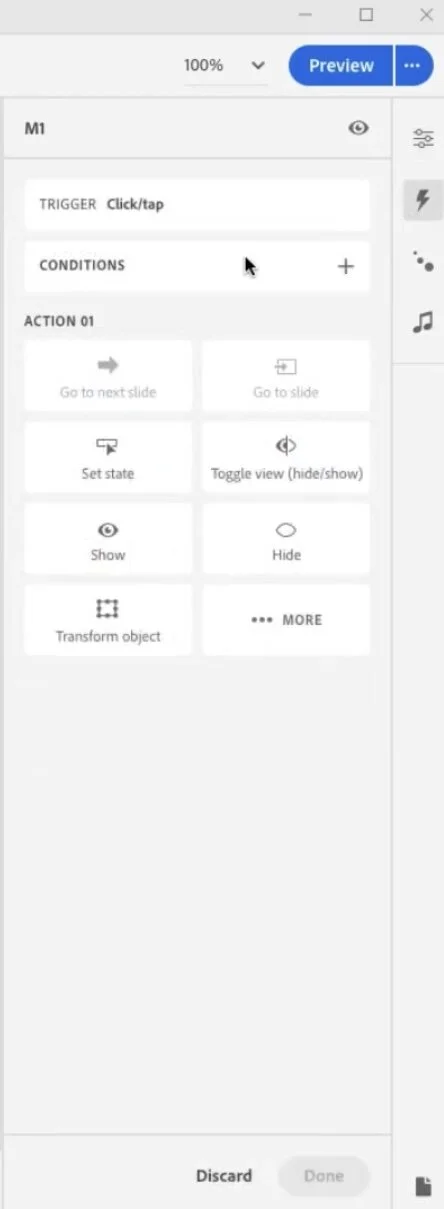
Triggering actions (advanced actions?)
Here you can see you can trigger actions for clicking on certain objects. Pooja demonstrated the ease of creating a click to reveal interaction that required far fewer steps than a similar interaction today.
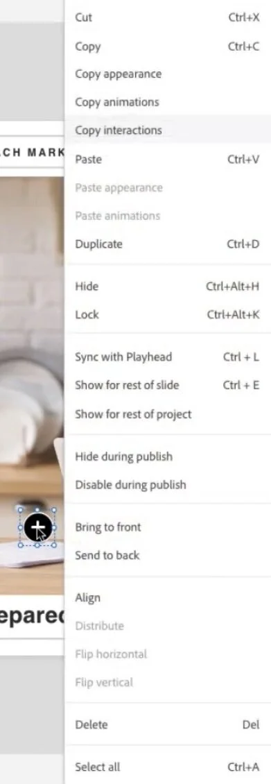
Copying and pasting interactions
I love that you can copy and paste interactions once you have built one example. Here Pooja created one click on her click to reveal and merely copied and pasted the action make a small revision to the action to Shaw a different state. What a time saver.
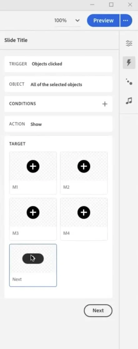
All selected objects clicked
And then with a simple work flow you can select a final action to run when all the objects have been clicked. This offers a huge time saver for creating forced navigation interactions. A great replacement for the time consuming advanced actions. I'm curious if I can do everything I can presently do with advanced actions but I definately like what I'm seeing.
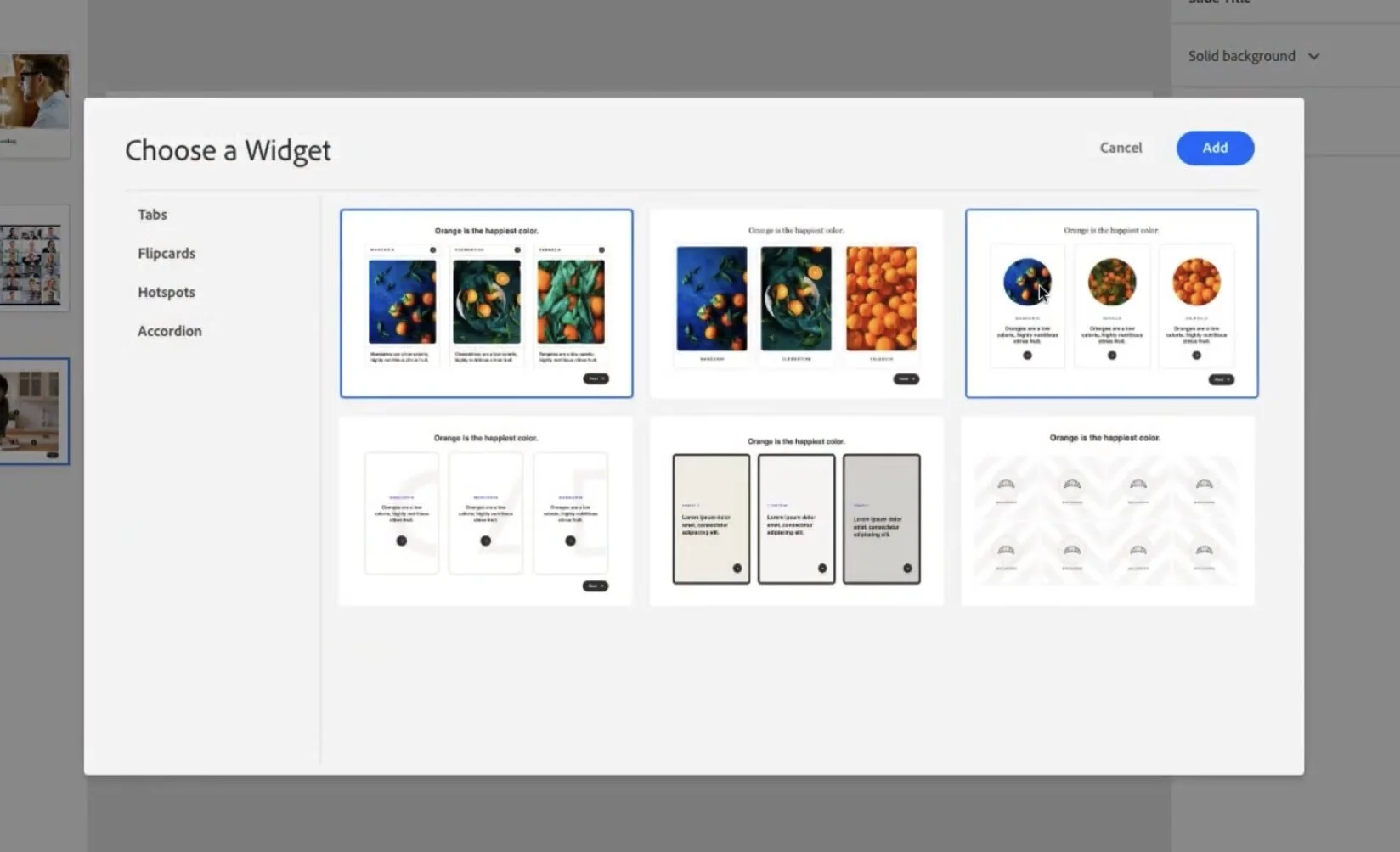
The new widgets
When I think of widgets I think of the old SWF based widgets from past versions of Captivate, or perhaps the learning interactions that only offered limited abilities to customize. In this new release widget looks like it means something else. These widgets have a modern look that I wouldn't hesitate to use in my eLearning projects.
Question slides
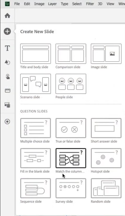
Workflow is something we don't think about too often but every extra click allows you down. Over the course of using software for years that can really add up to wasted time. Adding question slides has always been a multiple step process. Nice to see that we can just add a matching slide with two simple clicks.
Multiple question slides layouts
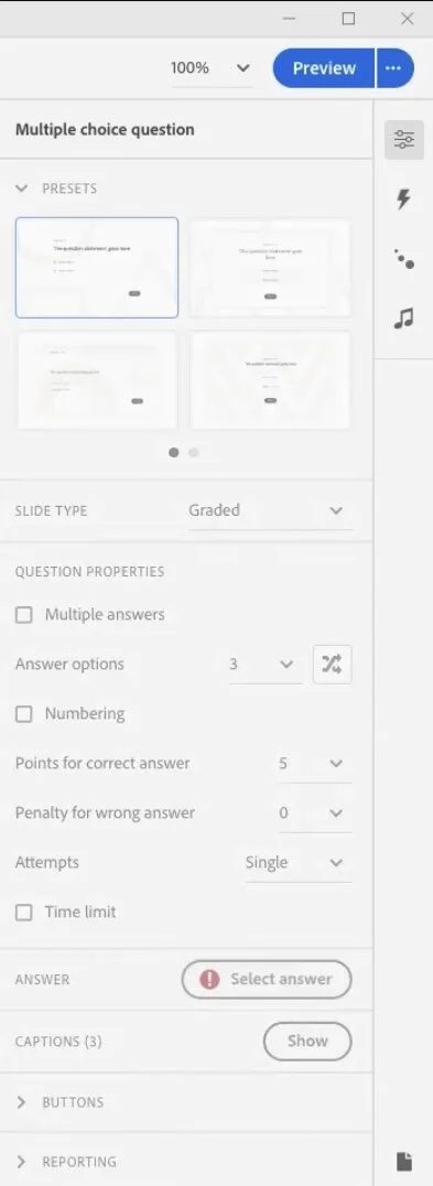
We've always been able to design extra matter slides to advocate different question slides layouts. I'm wondering if this is now built in. You can see the quiz panel has this selection option for quickly changing the look and feel of your question slides. Looking forward to getting my hands on this to try it out. This quiz results slide has something similar as well. Like I said can't wait to see it for real.
I love the sneak peeks we get from Adobe. Don't forget that some or all of what's in this sneak peek may not be in the final release of Adobe Captivate. I'd love to hear what features you would like to see in the next release. Put your thoughts below. Also if you saw something I missed let me know. I will cover responsive design in a seperate and future post.
By the way here is the link to view the sneak peek for yourself.
Additionally, if you would like to sign up for the beta for this project you can provide your personal information here: https://forms.office.com/r/d3bjdwhqbG
