Full Review - Adobe Captivate 2017
So I've been using the official release of Adobe Captivate 2017 for about two weeks now and I thought it was about time to share a full review.
First of all, let me talk about Fluid Boxes. The best way I can describe Fluid Boxes is that they are object containers that resize themselves in predictable ways. They eliminate objects from overlapping with one another when shown on various different devices with different aspect ratios and resolutions. To me, this is a huge improvement over wrangling with breakpoints and trying to get content to work across all the different breakpoints. It's no secret that I was not a fan of breakpoints. To me, it just increased development time. Fluid Boxes, while they take some getting used to, will reduce your development time versus using breakpoints in Captivate 9.
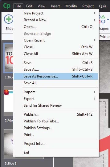
When Captivate 8 was released and introduced responsive design to eLearning, one question came up again and again. "What about my old projects?" I was hoping to see this addressed in Captivate 9 but unfortunately, it was not. In a way, I'm glad because I don't think Captivate 9 would have handled it well. With Captivate 2017 I can open a non-responsive project and save it as responsive. It literally is that easy. Of course when you open the newly created responsive project there will be some work ahead of you as you tweak most of the items and their placement on each slide, however, it will be a fraction of time compared with what it would be prior to Captivate 2017.
Adobe Captivate 2017 Edition also comes with Typekit integration. I like this feature but I want to give a warning. If you are a casual Adobe Captivate user, in other words, if you might not have or maintain a license of Captivate in the future you might want to think long and hard about using this feature. Typekit integration expects that you maintain your license to use the fonts that are included with any paid subscription. For example, if you subscribe to the Creative Cloud, there are certain fonts that are available to you. If you use those fonts in an eLearning project and your Creative Cloud membership lapses, so do your access to those fonts. You could be breaking your clients eLearning project if you don;t keep your subscription up to date. Of course, there are many fonts that you can use just by maintaining your free Adobe ID. You might want to consider using those if you don't know what the future has in store for you.
Responsive text support in Adobe Captivate 2017 is really good. There are two aspects to this. The first is that fonts will scale down as your project is displayed on smaller screen sizes. You can control what the bottom limit is. For example, on a desktop computer, your course could display a 28 point font, as you view that course on increasing smaller devices that font size will shrink until it reaches a limit that you get to set. If the amount of text cannot be further scaled down your users will see a small pop out icon that when tapped will open a semi-transparent window that will display the full text of what your user isn't able to see. tapping a second time will close the text window and return the user to the regular project. If there is too much text even for the pop out window users will be able to scroll up and down and see all the text.
If you are a learning department manager or a freelance designer like me, this upgrade gets a recommendation from me. Adobe Captivate 2017 Edition is an important milestone in the goal of responsive design eLearning. To me, there continues to be no better value in eLearning design tools. Adobe has cemented their position as the industry leader in mobile eLearning design for years to come.
If you are a learning department manager or a freelance designer like me, this upgrade gets a recommendation from me. Adobe Captivate 2017 Edition is an important milestone in the goal of responsive design eLearning. To me, there continues to be no better value in eLearning design tools. Adobe has cemented their position as the industry leader in mobile eLearning design for years to come.


